CSS
Back to Front-End Essentials
HTML
Javascript
React
CSS Basics
- Basic in-line CSS:
<p style="font-size: 21px;">Hello</p>
- Rule:
body { color:black; } <-- This is a rule. Consists of a selector (body, or .class or #id) and property:value declarations
- Because
letter-spacing is so small, these are usually done in px, like 1-2px
- Conventions:
<div class="a-box"> Use lowercase, use hyphens (not underscores or camelCase), numbers only if NOT first character- When you have multiple selectors, keep those near the top of the css. More general rules at the top. More specific, bottom
- Typically, styles on
p can be put in body, so it also applies to everything that aren't in p (like a)
- Use
section instead of div when it is understood to be a layout element with an h1, h2, etc title
- Things to Set on Every Site:
* {box-sizing: border-box;} - this changes the default (content-box) and allows setting width/height to include the padding and borders of the elementbody {margin: 0;}: Background colors, etc will not extend to the edges of the screen because browsers have built-in margin to avoid text starting on the edges. Turn it off at the top of your css, always for every site.h1, h2, h3, p { margin-top: 0; }: Do this for text elements when starting to stay consistent (because the browser automatically gives margin-top for these on all pages)img {max-width: 100%; display: block;} is also a good thing to always use on every site. Images are default inline-block, which leads to weird spacing sometimes.
- 4-Step Starting Point
line-height: 1.6; for body, from 1.4 to less than 2. Smaller for headers#eee or off-white for background, #444 or off-black for textfont-size: 18px; at least for bodymax-width: 650px; around that for main text container
The Box Model
- Elements: By default, they are "block level". Width is 100% of their parent, and height is 0 and grows to the content. Stacks on top of each other.
- By default, setting width and height of an element in CSS does NOT include padding, border, or margin. Just the content itself. This is because
box-sizing is set to content-box by default. Change to border-box to have width/height setting include the padding and border
- Margin: Sets space around the outside of the element.
- Heading, paragraphs, text etc. by default have
margin-top and margin-bottom set equal to font size.
- Collapsing Margins:
- If top element has
margin-bottom: 25px and bottom element has margin-top: 50px, the margin space is actually 50px and not 75px.
- Parent/Child margins will merge with each other where they touch. e.g. If a parent has
margin-top: 0px, and its first child has margin-top: 50px, those will merge and the parent will move with the child! To prevent margins touching each other (causing unpredictable behavior), use padding on parent element to separate its margin from its childrens'.
- Padding: Sets space inside the element. Uses same format as above.
-
Margin and Padding use the same forms:
margin: 10px 20px 100px 40px; ==> margin-top, margin-right, margin-bottom, margin-leftmargin: 10px; ==> all margins set to 10pxmargin: 10px 20px; ==> top&bottom are 10px, left&right are 20pxmargin: 0 20px 10px; ==> top is 0px, left&right are 20px, bottom is 10px
- Borders:
border: 2px solid pink; Width, style, color (order doesn't matter?). For single side, border-left and so forth. Can also do border-bottom-color: red; to override a property of a single border side
- Visual:
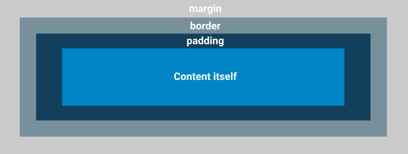 (If you set a
 background-color for the content, it would only cover the padding and the content itself.)
- The width and height of an element is the sum of the content, paddings, border, and margins.
- Centering:
margin-left: auto will set all available space on the left side (meaning the element is pushed to the right edge of the parent)margin: 0 auto sets both left and right to auto, centering the element inside its parent- HOWEVER, setting margin top/bottom to auto does NOT center vertically
CSS Advanced
- Try to avoid setting the height of an element, as it can lead to annoying overflow problems.
- Flexbox:
- has killed
float
- Setting
display:flex; on an element makes all its children become columns. So set it to a div wrapping all your columns.
- Margins no longer collapse if using flexbox
- Inline elements: Good for decorations where you don't alter size (margin/padding). You can't nest a block element inside one (
<span><div></div></span>), cannot set margin/padding on top/bottom (only left/right), and cannot set width/height. Use inline-block for inline with margin/padding
display: inline-block: inline, but can set margin/padding. Often for buttons: use padding for the size, not width/height.- Use multiple classes for an element if you have some styling that's more generic and some more specific:
<a class="btn btn-accent">
- Font stack: backup fonts as commas after font-family
- Sectioning layout contents:
- Position:
position: absolute; allows you to place content anywhere on the page. Useful for overlapping
justify-content: space-between can push children to left/right if using display: flex or inline-flex- Vertically Align:
transform: translateY(-50%); - takes 50% of the height (y) of the div and moves the div up (negative) by that amount. Combine with top: 50%;, this is a way to vertically-align to parent div
- Keyframe Animations: in CSS file,
@keyframes animationName {} using js naming convention. In here, specify from 0-100% the steps (like opacity: 0, etc) using 0% {}. Then in the div you want the animation in when it loads, call animation: animationName 0.5s, with seconds last
Selectors
- Universal selector (*) - all the children of. When used by itself, it selects every single element on the page
- Attribute selector -
input[type="text"] - select inputs with a type attribute of "text"
- Selector Combinators: (better to just specify classes instead because combinators can cause specificity wars)
- Descendant selector:
.my-class p means all p that are somewhere inside .my-class
- Child selector:
.my-class > p means all p that are the direct child of .my-class. More specific.
- General Sibiling selector:
.my-class ~ p means all p that generally follow a .my-class element, and they both have the same parent
- Adjacent Sibling selector:
.my-class + p means all p that directly follows .my-class, and they both have the same parent
- Pseudo-Classes: keyword added to a selector to target different states of the element. ORDER MATTERS, because the last CSS rules are applied last
- Link-related:
- Setting just
a will apply the rule to every state. Usually you'd do this first, then target the individual ones below as needed
a:link - only <a> with a href. Same as a[href]. Changes the default look. Only applies to NOT visited, NOT focus, etc.a:visited - a link that's been visited before. Often the same styling as a:linka:hover - cursor hovering over link. Often the same styling as a:focusa:active - when mouse is actively pressed down on it; usually a flasha:focus - using tab; what it looks like tabbed. Applies to text input etc, not just links#id:target - when used with a hash ID, target will match that ID whenever the current URL has that hash. e.g. at URL yoursite.com/#home, #home:target will match
- Position-related:
:root - root of the document; almost always the html element:first-child / :last-child - if the targeted element is the first/last child of its parent:nth-child() (:nth-last-child() is the same, but counts from the bottom)
:nth-child(3) - selects the 3rd child:nth-child(even) / :nth-child(odd) - selects even/odd children:nth-child(3n) - selects every 3rd child:nth-child(4n-1) - (4x0)–1 = -1 (no match). (4 x 1)–1 = 3rd Element. (4x2)–1 = 7th Element ...etc.
:nth-of-type() - like above, but if there are children of different types. e.g. img:nth-of-type(odd):nth-last-of-type() - like above, but counts from the bottom instead of the top:first-of-type / :last-of-type - div img:first-of-type would select the first image inside the first div and the first image inside the second div, etc.:only-of-type - if the element is the only one of its own inside the parent
- Others:
:not() - e.g. div:not(.music) = all divs except those with a class of “music”. e.g. input:not([disabled]):empty() - elements with no text and no children: e.g. <p></p>
- Pseudo-Elements: like pseudo-classes, because they don't select any "real" elements on the page
::first-letter - selects the first letter of the text in the element::first-line – selects the first line of text in the element (responsive)::before / ::after - add content before/after the rest of the content inside the element
div::before { content: "before"; } will result in<div>
before<!-- Rest of stuff inside the div -->
</div>
Responsive Design
- Absolute units: like px
- Percentage % units are relative to the parent of the element. Usually used for width.
- Relative units are usually relative to the font-size, but could also be relative to the viewport (vw, vh, vmin, vmax).
- em is relative to the element's font size (default font size is 16px, 2em is 32px). If applied to an element's font-size, then it is relative its parent's font size. Can cause an unwanted "compounding" effect going through each parent of an element
- rem is always relative to the root of the document (html element).
- em vs rem: rem is easier to manage for font-size, but for margins/padding, em makes sense to be relative to the element's font size.
max-width and min-width: If your element is width 100% and you don't want it to get too big on big viewpoints, set a max-width to a fixed value like 620px. min-width lets something now get too small in small viewports.object-fit: for images, choose how you want it to fit a certain height/width. Most commonly, cover is used to crop the image to the right size instead of stretching it. Also object-position to change where the crop occurs- Media Queries
@media media-type and (media-features) { ... } where only media-type or media-features is required (but both can be targeted as well)media-type includes screen, print (for when users choose to print your page), and speech
- e.g.
@media print { ... }
media-features includes width, orientation, or specific features like hover (whether the user can hover with a cursor)
@media (min-width: 375px) and (max-width: 800px) { ... } would target all types of media with minimum width of 375px and maximum width of 800px
@media screen and (orientation: portrait) { ... }- Inside a media query, we need to nest in the selectors (body, etc)
- Remember to declare your media queries in order to not override anything, especially putting them after the default rules
- To help determine what widths to put breakpoints, look for a point in which the body text stretches too long to comfortably read
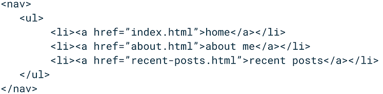
- Navigation
- Best Practices
- When starting to write the markup, best to look at the most complicated design first. Usually a desktop size
- When starting to write the CSS, start with the smaller screens: Mobile-First. Typically you'll be making min-width Media Queries (everything in the query for larger and larger screens)
Background Images / Gradients
background-image: url(folder/filename.jpg); /* don't forget to use .. as necessary from the css folder */- A background image is just decoration and takes up no HTML, so it doesn't have properties, etc of its own. It fits the space of the element. Tiles by default to fill the space.
- Commonly used:
background-position: center; and background-size: cover;
- Good practice to also have a
background-color on top, in case the image doesn't load, to ensure text is readable, etc.
background-blend-mode: multiply;
- Blend a
background-image with a background-color or another background-image
- For 2
background-images, use a comma to separate them on one line
multiply - increases darkness so neither has colors brighter than the otherscreen - increases lightness so neither has colors darker than the otheroverlay - increases contrast by making dark colors darker and light colors lighter
- Gradients are a type of background image:
background-image: linear-gradient(red, blue); (or just background as shorthand)
- (or radial-gradient)
- by default, linear-gradient is top-to-bottom. You can make it left-to-right by adding at the beginning:
linear-gradient(to right, red, blue). Can also say to bottom right, etc
- linear-gradient diagonals using degrees:
linear-gradient(45deg, red, blue)
- Can make block colors, stripes, etc. using %:
linear-gradient(red 25%, blue 25%, blue 50%, red 50%, red 75%, blue 75%) ... this will make 1/4 red, 1/4 blue, 1/4 red, 1/4 blue.
- Can set border gradients by specifying
border: 5px solid; first, then
border-image: linear-gradient(to left, red, blue) 1;
Putting the 1 specifies the border-image-slice, which if you're using real images, tells the browser how to position the pieces. Since it's just a gradient, using 1 is ok
Viewport Units
vw - viewport widthvh - viewport height
body { height:100vh; } is often done when you want your body to be the full height of the screen. On default, body height is as tall as its contents (making the background property misleading)
vmin - viewport minvmax - viewport max. The min/max compare the viewport's height & width and returns the min (smaller) or max (larger)
Forms
<form action="/page.html" method="post"> </form>- To properly connect labels & fields, use the same
for and id for them:
<label for="fname">Name:</label><input id="fname" type="text" />- You could also wrap the input inside the label tag for the same functionality (though it could be limiting)
- If you are not using labels, using
aria-label can fulfil that function from an accessibility viewpoint
Transitions & Transform
transition: color 1s; - color 1 second transition- Good practice to specify the property being transformed. By default, it is
all, which is bad for performance
- Common mistake to put transition on a pseudoclass like
hover - this will only make the transition happen when the element is being hovered. Off hover, it snaps back to normal. Put transitions on the normal element
transform: scale(3); - makes the element look 3x its size; does not affect the layout
Flexbox
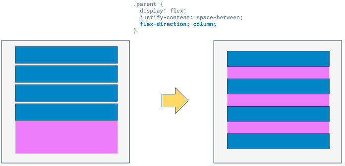
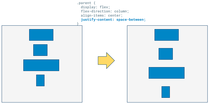
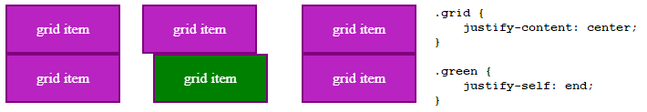
justify-content: used in the flexbox parent. Acts on the main axis: If the flex parent has the default flex-direction of row, it's the horizontal axis. If flex-direction is set to column, the main axis is the vertical axis.
space-between will take empty space and distribute it evenly between the column children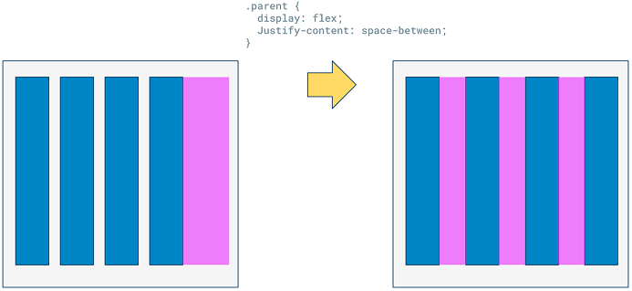
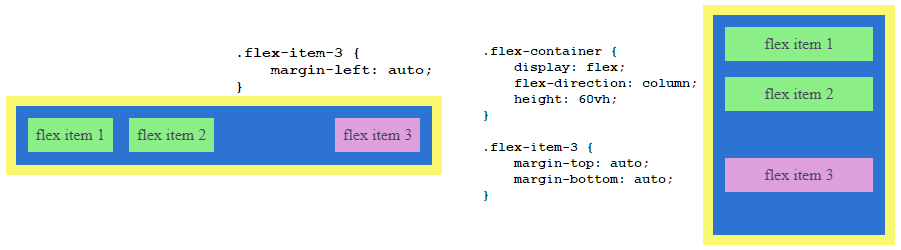
space-around will also distribute the space around the leftmost and rightmost columns as well. It gives equal space to both sides of each column, meaning the middle spaces will be double as wide as the edge spaces.space-evenly like space-around except each column has visually the same amount of space on left and rightflex-start aligns children to the left -- this is the defaultcenter aligns children to the horizontal centerflex-end aligns children to the right- If you want to align individual children on the main axis, you can use
margin: auto where appropriate to align a child in the center of whichever direction
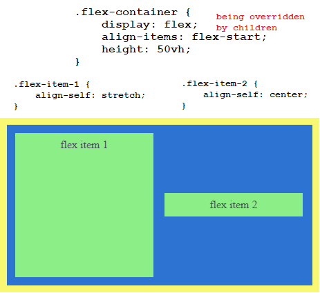
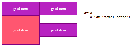
align-items: used in the flexbox parent. Acts on the cross axis: If the flex parent has the default flex-direction of row, it's the vertical axis. If flex-direction is set to column, the cross axis is the horizontal axis.
stretch is default. The column children will all stretch to match the height of the flexbox if a height is set, or the child with the tallest height (as this will cause the parent's height to be that height)flex-start will vertically align the children to the top, no longer stretching the children to the tallest one. Each child's height will match its contents.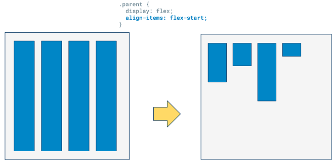
center will vertically align the children to the center, which is a great way to vertically center elements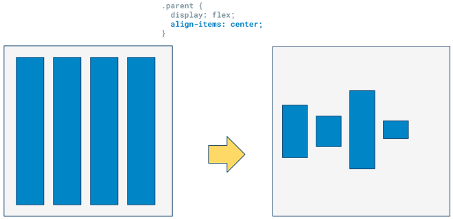
flex-end will vertically align to the bottom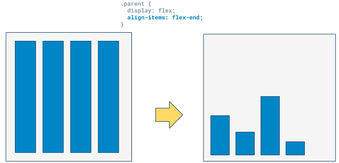
baseline vertically aligns the children by the line where the biggest font sits on, so children with smaller text will shift down accordingly- You can also use
align-self on a child to have it individually align on the same axis of align-items
.flex-child:nth-of-type(3) { align-self: flex-end; } will target the 3rd flex-child
flex-direction: set to row by default, meaning the parent is a row and the children are columns
flex-direction: column sets the parent to a column, which children being rows- This switches the main axis, so
justify-content will now add horizontal space between children, and align-items will now horizontally align the children
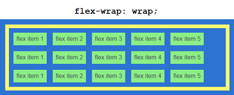
flex-wrap: wrap; default is nowrap, which forces flex items onto one line (can cause scrolling, etc)
wrap allows flex items to wrap to multiple lines within the flexbox if there's not enough space to fit on one line, staying within the width and adding height (if flex-direction: row).wrap-reverse reverses align-items direction and the direction of new lines when wrapped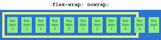
flex-flow: row wrap;: includes flex-direction and flex-wrapalign-content: only works when the flexbox has multiple lines of children (flex-wrap)
- If the parent flexbox has a set height, on default all children (including multi-line) will stretch to fit the whole parent
align-content can make the (multi-line) children keep their size and organize themselves, such as at at the flex-start (leaving empty space at the end of the parent)- In multi-line scenarios,
align-items is only concerned with aligning the items vertically within each row
- When multi-line,
align-content will act as the align-items for all the children as one unit
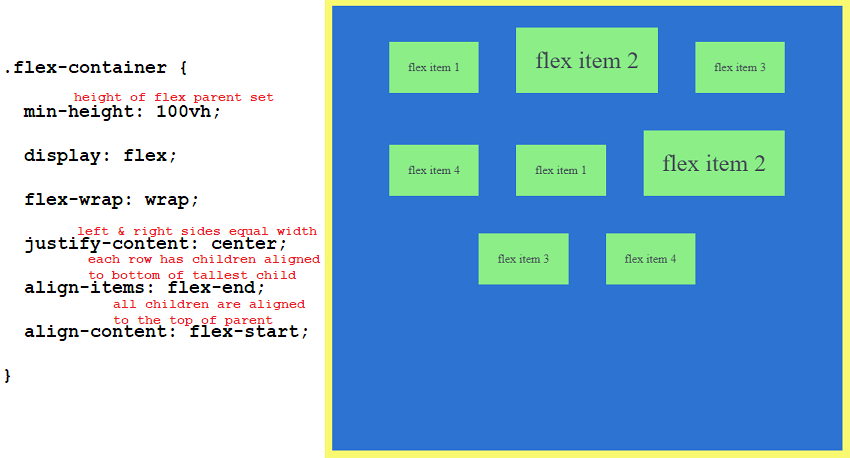
space-between, space-around, and space-evenly are valid values as well
- Flexbox Children Properties
order: 2;
- Change the order a child shows up on the page
- Default is 0
- Does not affect
nth-of-type() selector, which looks at HTML only
flex-grow: 0; allows children to grow to fit available space on the main axis if parent's width (if flex-direction: row) or height (if flex-direction: column) is set. 0 by default. Setting 1, 2, 3, ... changes the relative sizes of the children's growth
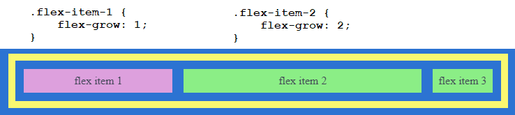
- Because
flex-grow works on the main axis, justify-content won't work anymore if grow is on
flex-shrink: 1; when the flexbox parent is too small to handle its children, they will start to shrink (even if their width/heights are set). You can control which children shrink more than others. Default is 1, setting to 0 will not allow that child to shrink.flex-basis: auto; works on the main axis, setting the ideal width (if flex-direction: row) or height (if flex-direction: column) of the child
- The ideal size is the size of the element if there is no shrinking/growing happening. By defaults, elements will shrink if the parent is too small
- Default is
auto, so it will match the child's size to its content. But if a width/height is set, it will use that
- If
flex-basis is set to a value (like 300px), it will override any width/height and use that
flex-basis: 1; will cause the item to shrink rapidly to reach as small as possible- Can be overridden with
min/max-height and min/max-width, because those take precedence. So be careful with those
- If you just set
flex: 100px;, that is the same as setting flex-basis: 100px; but also with flex-grow: 1;
- Useful when using media queries and changing flex direction, as a width value can switch to the height seamlessly
flex: grow shrink basis; - shorthand for all three
grow is the only one you have to specify, the others are optional- If you don't specify a
basis, it will be 0px, NOT auto
flex: initial; is the same as the default, which is flex: 0 1 auto;flex: auto; is the same as flex: 1 1 auto;, which is VERY commonflex: none; is the same as flex: 0 0 auto;flex: 5; - grow: 5, shrink: 1, basis: 0pxflex: 30%; - grow: 1, basis: 30%flex: 3 4; - grow: 3, shrink: 4, basis: 0pxflex: 1 30px; - grow: 1, basis: 30px
align-self individually aligns the child on the cross axis (same one as align-items)
- Margins: To do something like align-self for the main axis, use
margins
- Remember, margins no longer collapse inside a flexbox
- To set the left/right of a single child (if
flex-direction: row) or top/bottom (if flex-direction: column), use margins
CSS Grid
- Work with columns and rows at the same time
- Like flexbox, margins will no longer collapse and direct children become grid items
- Put
display: grid; on the parent
grid-template-columns: 200px 200px 350px; - creates 3 columns of specified widthsgrid-template-rows: 50px auto; - creates a rows of 50px, and auto creates a row that will be as tall as its tallest child (it's also the default)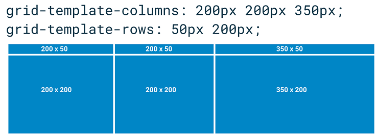
- Shorthand:
grid-template: 50px 200px / 200px 200px 350px; - starts with rows. Accomplishes the same thing as the above two lines
- Will automatically place the first # of children as specified, then the rest overflow into automatically created rows/columns
- You can also specify the exact positioning of a child within a grid. On the child:
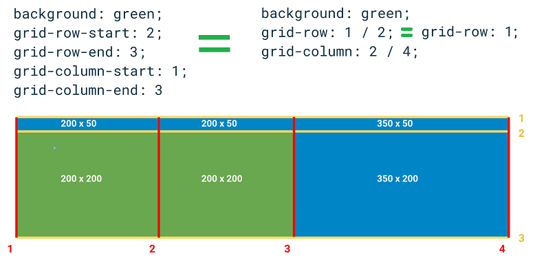
grid-column: 1 / -1; is a way to make a child stretch the whole width of the parent grid. Negatives are counted from the last row/column at -1, -2, -3...- Alternatively,
grid-column: span 2; means to have the content take up 2 cells. Can also specify starting location like grid-column: 3 / span 2;
- Children can overlap if you explicitly set their row/columns to
- By default, grid items will stretch to the size of the tallest & widest children of that row
- Setting
width: 100%; and height: 100%; will cause the content to match the size of its cell (and won't allow overflow)
align-items: start; is concerned with the up/down-ness of the rows.
- Acts like flex-start and have the children now be their own content size and align to the top of the row
- Can also say
end, center, etc
align-self: baseline; can align the up/down-ness of an individual child in its row
justify-content: end; is concerned with the left/right-ness of the columns.
justify-self: start; can align the left/right-ness of an individual child in its column
- Grid Gap
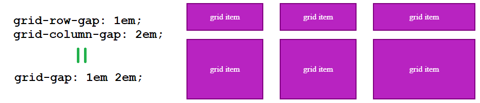
- Adds space between cells, not around (for those cases, make smaller empty rows/columns)
- Commonly you'll find something like
grid-gap: 0 2em; for touching row content but space between columns
- In the future, this will be replaced with just
gap and will be able to work with flexbox too
- The Implicit Grid
- If you create children in locations that are not explicitly specified by you through
grid-template, the grid will automatically create implicit rows/columns for them to live in
- These have a default
auto height and width
- Can actually specify for your implicit grid:
grid-auto-rows: 100px; and grid-auto-columns: 100px;
- Grid Areas
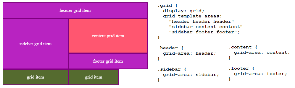 Unassigned grid items appear below the rest in their own implicit row
- Essentially, name different parts of your grid and assign items to those areas
- With media queries, this becomes powerful because you don't have to refine the positions of the children
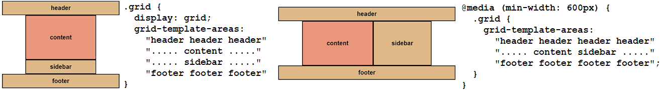 Periods are unnamed cells intended to be empty (may have as many .. as you want for readability)
grid-area: 1 / 2 / -1 / 3; can be used as shorthand for grid-row-start / grid-column-start / grid-row-end / grid-column-end
fr - fraction
- New unit that can be used with grid
grid-template-columns: 1fr 2fr; creates two columns that grow & shrink. 2fr will grow twice as fast- Approximately (not exact),
grid-template-columns: 3fr 2fr; would mean left column of size 3/5 and right column of size 2/5.
fr cannot be used as the minimum size in a minmax()
minmax(2em, 50%)
- New value that can be used with grid
grid-template-columns: 100px minmax(200px, 500px); to define the second column as willing to shrink to 200px and willing to grow to 500px
min-content & max-content
- New value that can be used with grid
grid-template-columns: 1fr min-content; will have the second column's content shrink its width as much as it cangrid-template-columns: 1fr max-content; will have the second column's content expand its width (such as having text all on one line) as much as it can. Won't add whitespace, just sets width to its max content
repeat()
- New value that can be used with grid
grid-template-columns: repeat(3, 1fr); makes 3 columns of size 1frauto-fill vs auto-fit
- Both will fill the element with as many columns of children as possible given the minimum size specified
repeat(auto-fill, minmax(200px, 1fr));
- Even if there are no grid children in them, new columns will be added if there is space
repeat(auto-fit, minmax(200px, 1fr));
- Will avoid the above by only creating as many columns as needed (no empty columns)
Flexbox vs. Grid
- Grid
- Making literal grids & layouts in 2 dimensions (x & y) instead of just one
- Layout-first: e.g. You create a layout and then place items into it
- Better at positioning cells in exact placements
- Better at asymmetrical and overlapping layouts
- Usually preferred for whole-page layouts
- Needing fewer media queries thanks to auto layout,
minmax(), repeat(), and auto-fill
- Flexbox
- Content-first: e.g. You have a set of items and want to space them out evenly in a container
- More suited for layouts that need to be flexible with content sizes, rather than planned fixed spaces
- Better at being flexible with placement for different viewports
- Combining both can be very powerful: A grid's children can be flexboxes, etc.
